Countries & Cities - Part 1
Introduction
The objective for the Countries & Cities page is to have a drop-down list of countries at the top of the page, and once the user has selected a country to show cities for that country with their populations. The user will be able to add, edit and delete cities for the chosen country.
As with the Countries page, we will take this step by step. However, unlike Countries the add and edit will be accomplished without the need to use a separate page.
YouTube Video
Navigation
I want to use the 'home' page to show Countries and Cities. To do this we must replace the existing code in Index.razor (found in the Shared folder in the Client project), but before we tackle the changes needed to that page we will amend the menu to delete those options we don't need.
In the Shared folder in the Client project open NavMenu.razor, delete the menu options we don't need (Counter and Fetch Data) and amend as shown below:
Index.Razor
To make a start open Index.razor in the Pages folder in the Client project and replace all existing code with the following:
@page "/"
@inject ICountryService CountryService

<PageTitle>Countries & Cities List</PageTitle>

<h3>Countries and Cities</h3>

@code{

}
Adding the Countries Drop Down List
We want a drop-down list at the top of the page to list the existing countries. To do this replace everything below the <h3> tags with this:
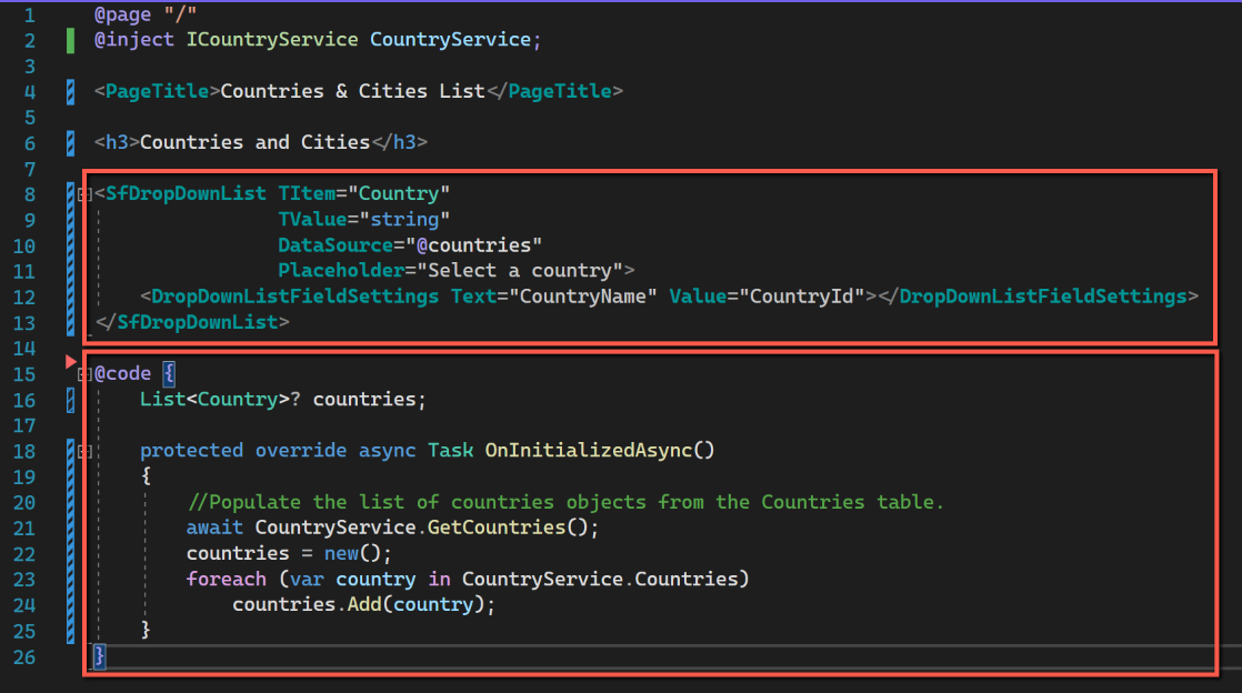
<SfDropDownList TItem="Country"
                TValue="string"
                DataSource="@countries"
                Placeholder="Select a country">
    <DropDownListFieldSettings Text="CountryName" Value="CountryId"></DropDownListFieldSettings>
</SfDropDownList>

@code {
    List<Country>? countries;

    protected override async Task OnInitializedAsync()
    {
        //Populate the list of countries objects from the Countries table.
        await CountryService.GetCountries();
        countries = new();
        foreach (var country in CountryService.Countries)
            countries.Add(country);
    }
}
We are using the Syncfusion SfDropDownList. This takes two properties, TItem, the data source type and TValue, the dropdown value list type. In this case TItem is set to '"Country" and TValue to "String". Also specified is the DataSource and a suitable placeholder.
Within the '@code' section 'countries' is declared as a List and the OnInitializedAsync() function used to populate 'countries'. This is the same as the code used on the 'CountriesPage'.
This is just about the minimum needed to display the dropdown list.
Sorting the Drop Down List
However, there are a number of improvements that can be made without too much difficulty. The first thing that is apparent is that the list is presented in the CountryId sequence; it would be much more usable in CountryName sequence.
One way to achieve this would be to create a new controller, service and interface that got the data in country name sequence. An alternative that I will adopt here is to sort the list of countries by name before finally populating the drop down list.
The code to do this is shown below. I have kept the datasource of the dropdown list as 'countries' and re-named an intermediate list as 'countriesUnordered'.
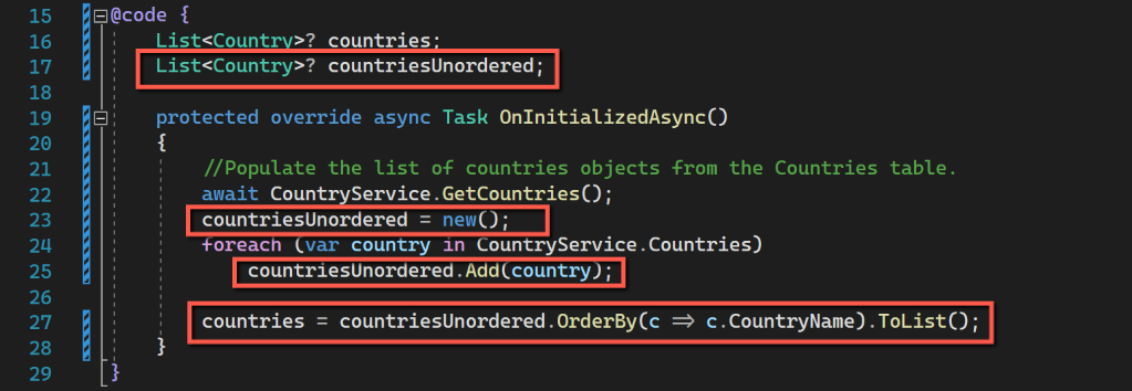
@code {
    List<Country>? countries;
    List<Country>? countriesUnordered;

    protected override async Task OnInitializedAsync()
    {
        //Populate the list of countries objects from the Countries table.
        await CountryService.GetCountries();
        countriesUnordered = new();
        foreach (var country in CountryService.Countries)
            countriesUnordered.Add(country);
        countries = countriesUnordered.OrderBy(c => c.CountryName).ToList();
    }
}
Re-sizing the Drop Down List
By default the dropdown list occupies the input element's width and with a height of 350px. These can be adjusted by adding 'PopupHeight' and 'PopupWidth' properties within the <SfDropdownList>
<SfDropDownList TItem="Country"
                TValue="string"
                DataSource="@countries"
                Placeholder="Select a country"
                PopupHeight="200px"
                PopupWidth="250px">
    <DropDownListFieldSettings Text="CountryName" Value="CountryId"></DropDownListFieldSettings>
</SfDropDownList>
However this only controls the height and width of the drop-down, not the width of the drop down list field. If we want to control how this is displayed we need to use some css (Cascading Style Sheet). The following seems to solve this problem.
- Add a <div> </div> around the whole dropdown list and give it class name of 'DropDownWrapper' (it could be anything), and add the following css between the HTML and Code sections.
<style>
    .DropDownWrapper {
        width: 250px;
    }
 </style>
Adding a Datagrid for Cities
Under the dropdown list for countries we will add a datagrid to show the cities for the selected country. To add the datagrid, add the following code in the HTML section of the page.
<div>
    <SfGrid ID="CityGrid"
            DataSource="@cities"
            AllowSorting="true"
            AllowResizing="true"
            Height="200">

        <GridColumns>
            <GridColumn Field="CityName placeholder"
                        HeaderText="City Name"
                        TextAlign="@TextAlign.Left"
                        Width="50">
            </GridColumn>
            <GridColumn Field="CityPopulation placeholder"
                        HeaderText="Population"
                        Format="n"
                        TextAlign="@TextAlign.Right"
                        Width="50">
            </GridColumn>
        </GridColumns>
    </SfGrid>
</div>
The above follows the pattern used for the Countries data grid. It is wrapped by <div>
Note that for the GridColumns the Field attributes only have placeholders for the moment.
We need to add the code to define the @cities data source. To do this add the following to the code section, immediately under the equivalent line for countries.
List<City>? cities;We have no data for cities, and there is no connection between the Countries dropdown list and cities data grid yet, but save all files and run the application. It should build without errors and show the following:
One last refinement is to put a blank row between the Countries dropdown and the Cities grid. Insert this between the two components to achieve this:
<br />The next stage is to link the Countries dropdown with the grid and create a mechanism to allow the user to add cities.
Code
Code changes for this post can be found here: Countries & Cities #1